S&P Global Platts cFlow
A vessel-tracking and cargo-intelligence platform for global commodity markets. A product analysis and contextual inquiry to surface critical UX friction—and a prioritized roadmap of quick wins for navigation, search, accessibility, and data filtering.
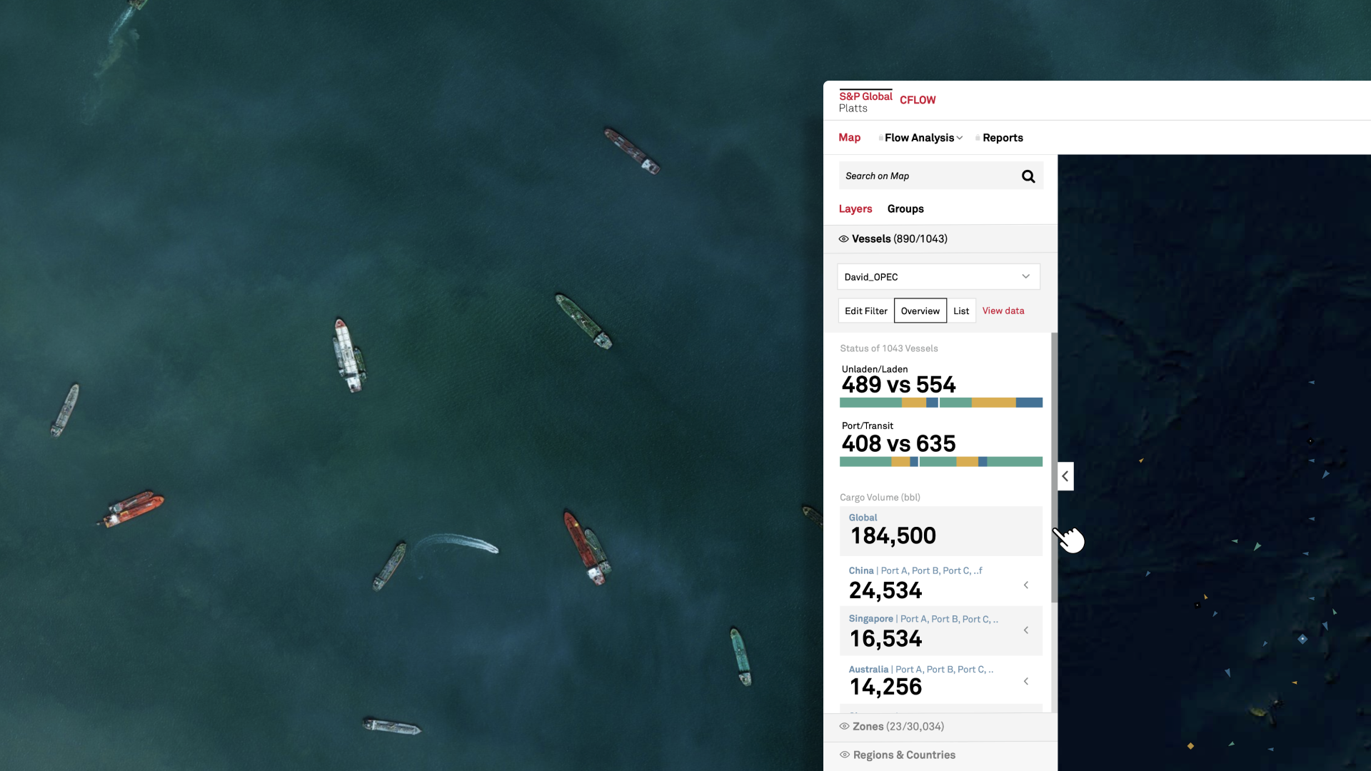 cFlow · Live Vessel Map
A control room for global commodity flows
cFlow lets analysts and traders watch the world's oil and commodity cargoes move in real time—every vessel, its laden state, its commodity, its route, and the zones it passes through. The map is the product: it's the entry point into pricing, flows, and reports. That density is the source of both its power and its friction.
in a single view
mappable
volume monitored
on Platts data
Product Analysis & Contextual Inquiry
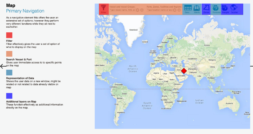
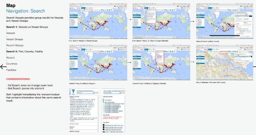
I started by mapping how the existing product actually behaves—walking each navigation element, each search path, and each map interaction as a user would. The primary navigation offered an extensive set of options that performed very different functions while sitting right next to each other, with no hierarchy to separate them.
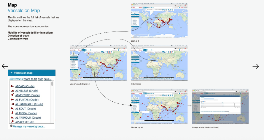
The map as a list
The "Vessels on Map" panel doubled as a list of up to 1,000+ vessels. Icons had to encode mobility (still vs. in motion), direction of travel, and commodity type all at once—legible to experts, opaque to everyone else.
Two searches, one box
Searching vessels behaved differently from searching ports and regions—one kept the zoom level, the other zoomed in. Same control, two mental models, no signal to the user about which they were in.
Flat option overload
Filter, search, data views, and map layers were presented as equals. Powerful, dissimilar functions sat side by side with no grouping—forcing users to scan everything to find anything.
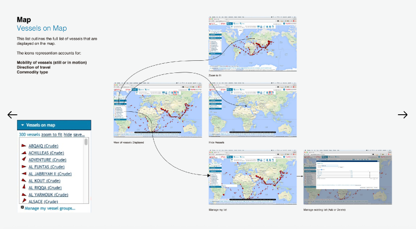
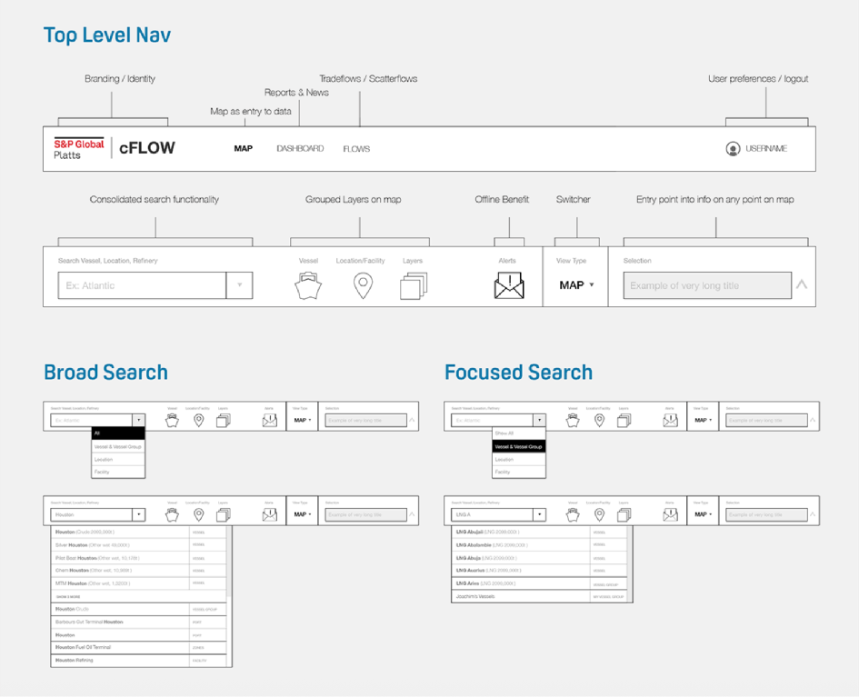
Consolidated navigation & focused search
The highest-leverage fixes didn't require re-architecting the product. By giving the navigation a clear hierarchy and splitting search into two intentional modes, the same dense toolset became scannable—a set of quick wins the team could ship without disrupting expert workflows.
Before
After
Accessibility at sea
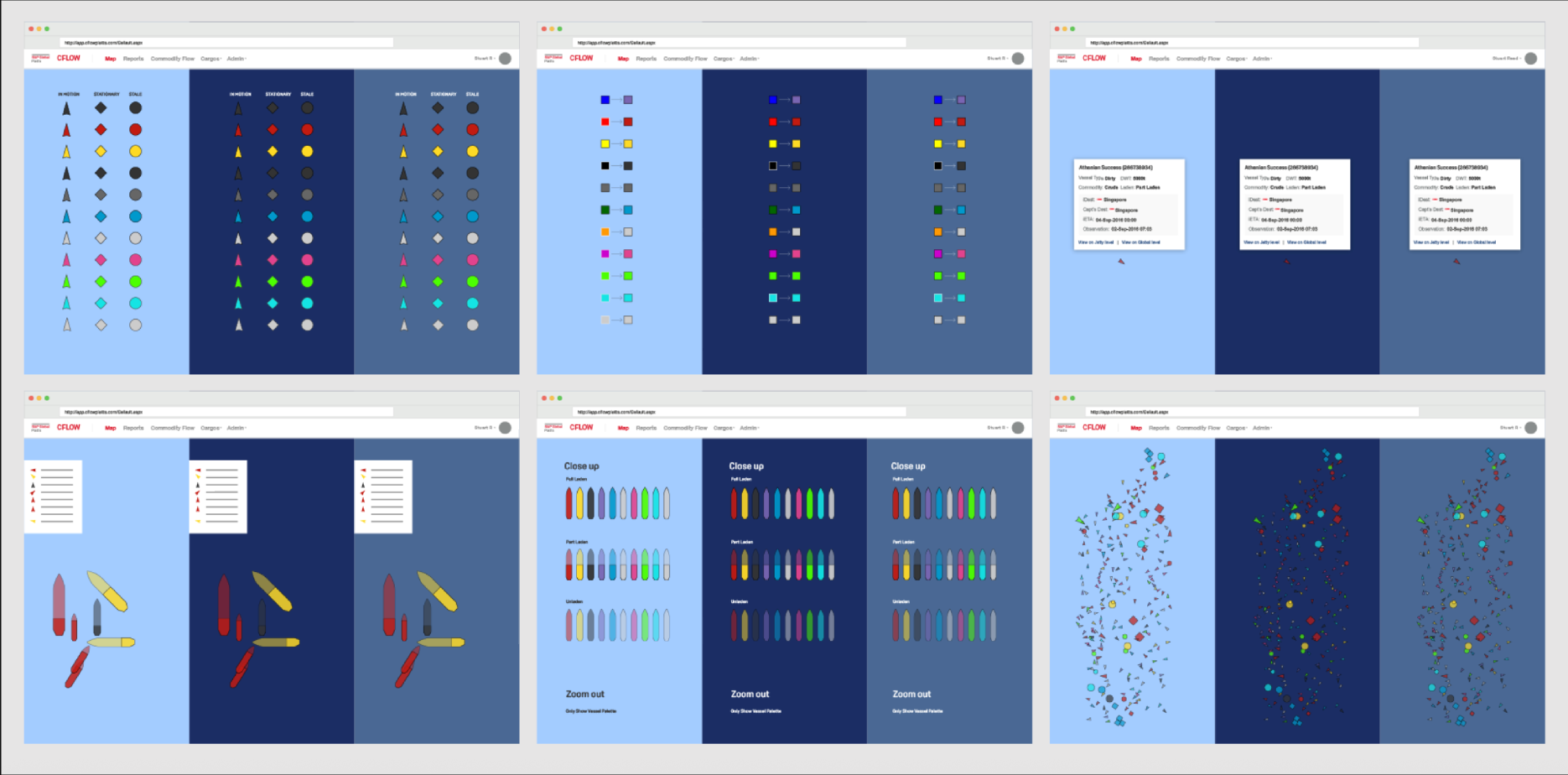
A single vessel icon has to carry several layers of meaning at once—and stay readable on a glare-prone screen, in a moving environment, at any zoom level. I treated the icon system as a small typographic problem: assign each variable its own clear, non-competing channel so the map reads at a glance.
Mobility, by shape
In motion, stationary, and stale vessels each get a distinct silhouette—so status is legible before color is even processed.
Commodity, by color
A consistent palette ties each icon to its commodity type, kept distinguishable for color-vision deficiencies.
Laden state, by fill
Full-laden, part-laden, and unladen vessels read through fill weight—visible up close without adding map clutter.
Density, by zoom
Detail degrades gracefully: when thousands of vessels cluster, icons simplify to a palette that survives the zoom-out.
Scenario prediction & calculation
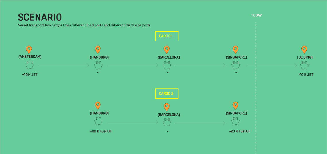
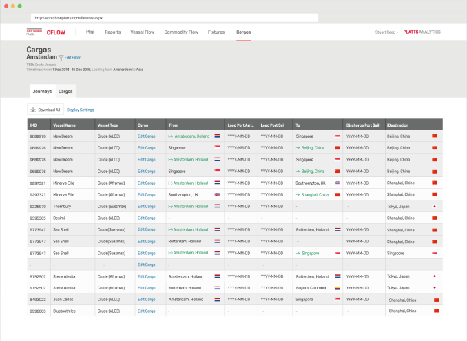
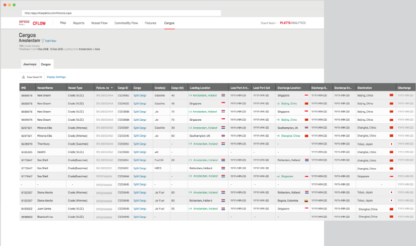
Cargo rarely moves in a straight line. A single vessel can carry two cargoes loaded at different ports and discharged at different destinations. The scenario model makes that timeline explicit—each load and discharge event placed against "today" so analysts can reason about what's in transit and what's already landed.
Filtering vessel data
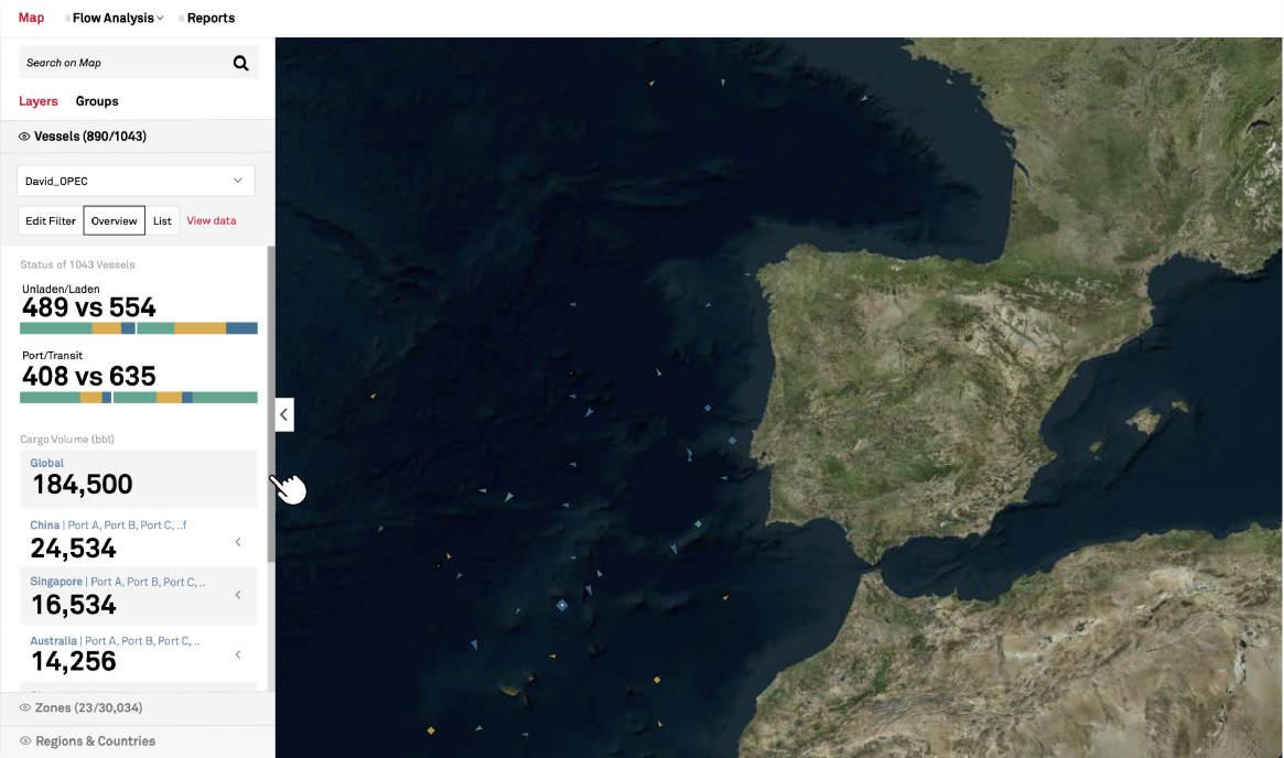
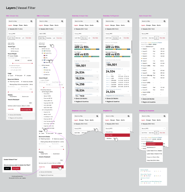
With a thousand vessels on screen, the filter is the steering wheel. I designed a layered filter that lets users narrow the fleet by type, weight, cargo, and movement status—and made it hold up across compact and fully-expanded states, with overview and list views of the same query.
Filter, in layers
Each dimension stacks, so a query can be as broad or as surgical as the question demands.
- Vessel type & weight — class and custom DWT ranges
- Cargo — laden, part-laden, unladen
- Movement status — steaming vs. stationary, stale-data flags
- Display & saved filters — named, reusable filter sets
Cargo in specific zones
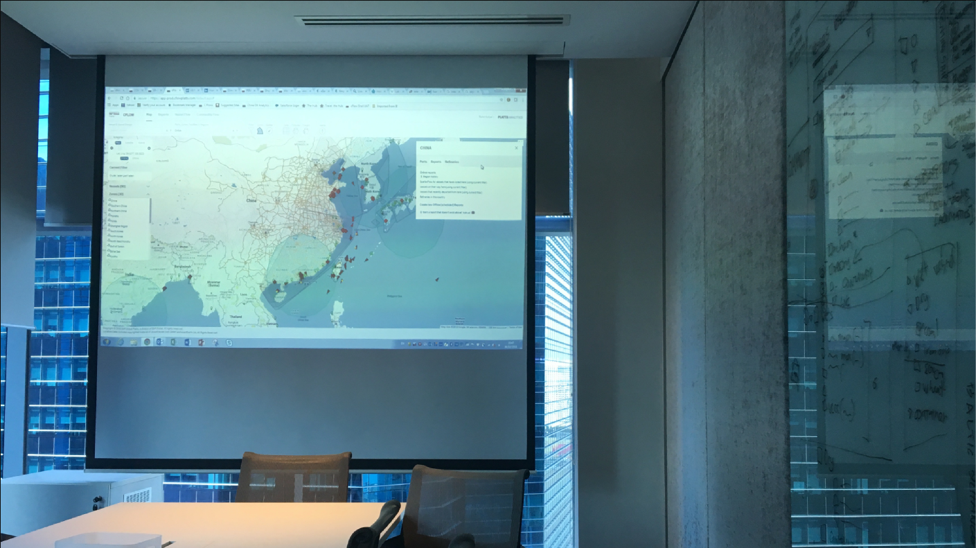
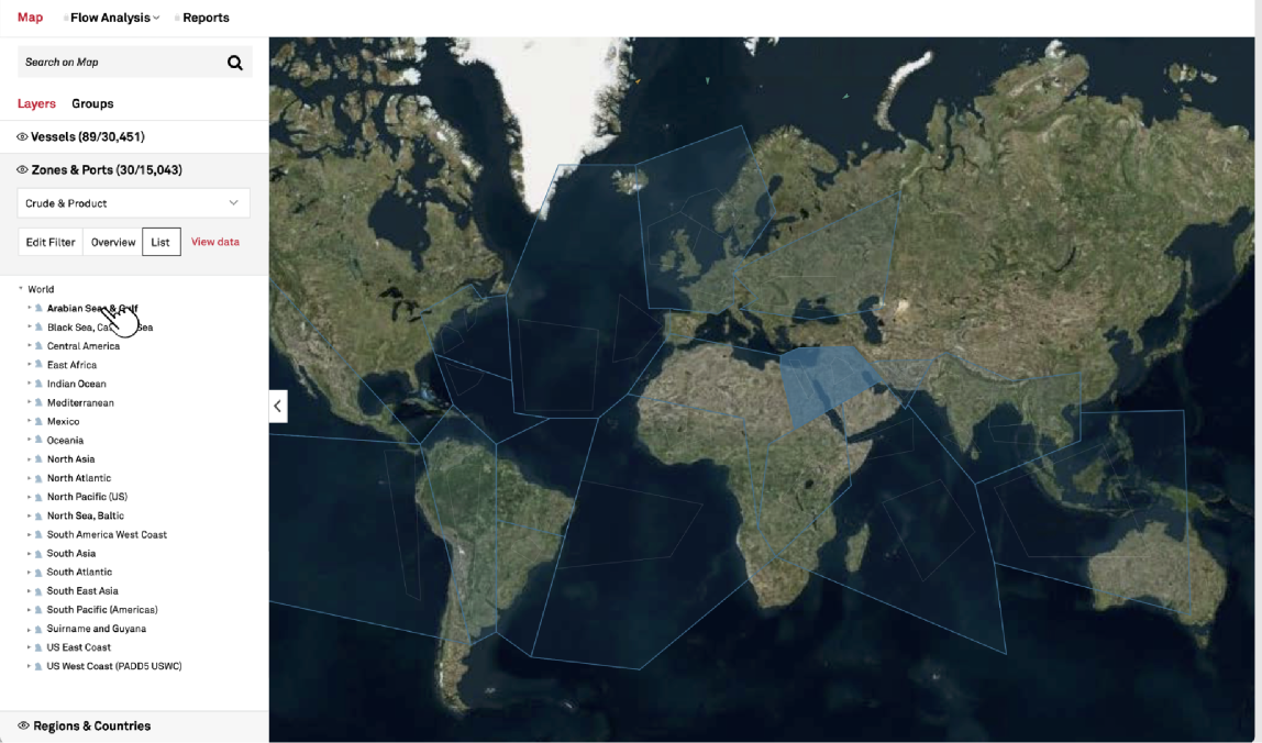
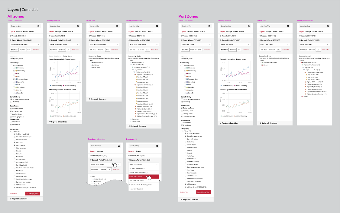
Beyond individual vessels, analysts think in zones—shipping lanes, port clusters, and regions where cargo accumulates. Zone-based geomapping turns the map into an analytical surface: draw or select a zone, and cargo intelligence for everything inside it surfaces in the same view.
From a dense tool to a readable one.
The product analysis and contextual inquiry turned scattered friction into a prioritized roadmap—quick wins in navigation and search, a more accessible vessel language, clearer scenario modeling, and filtering and geomapping that let analysts reason at the scale the market actually moves.
← Back to all work